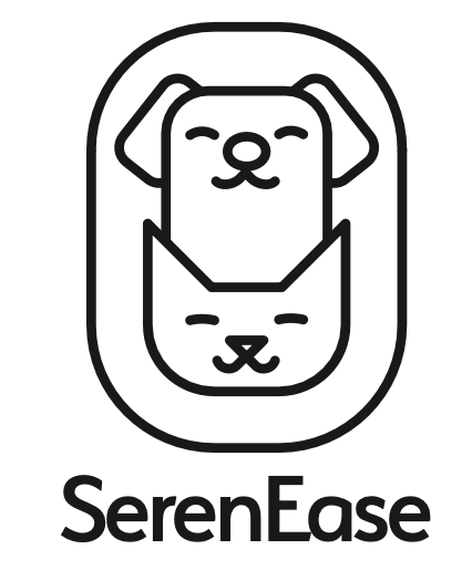
SerenEase
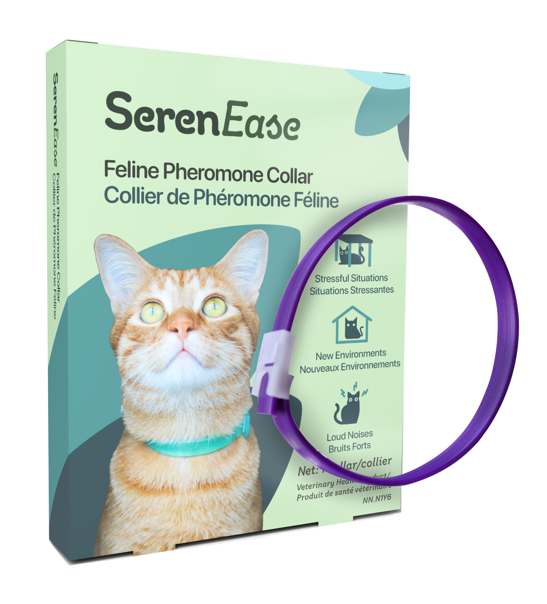
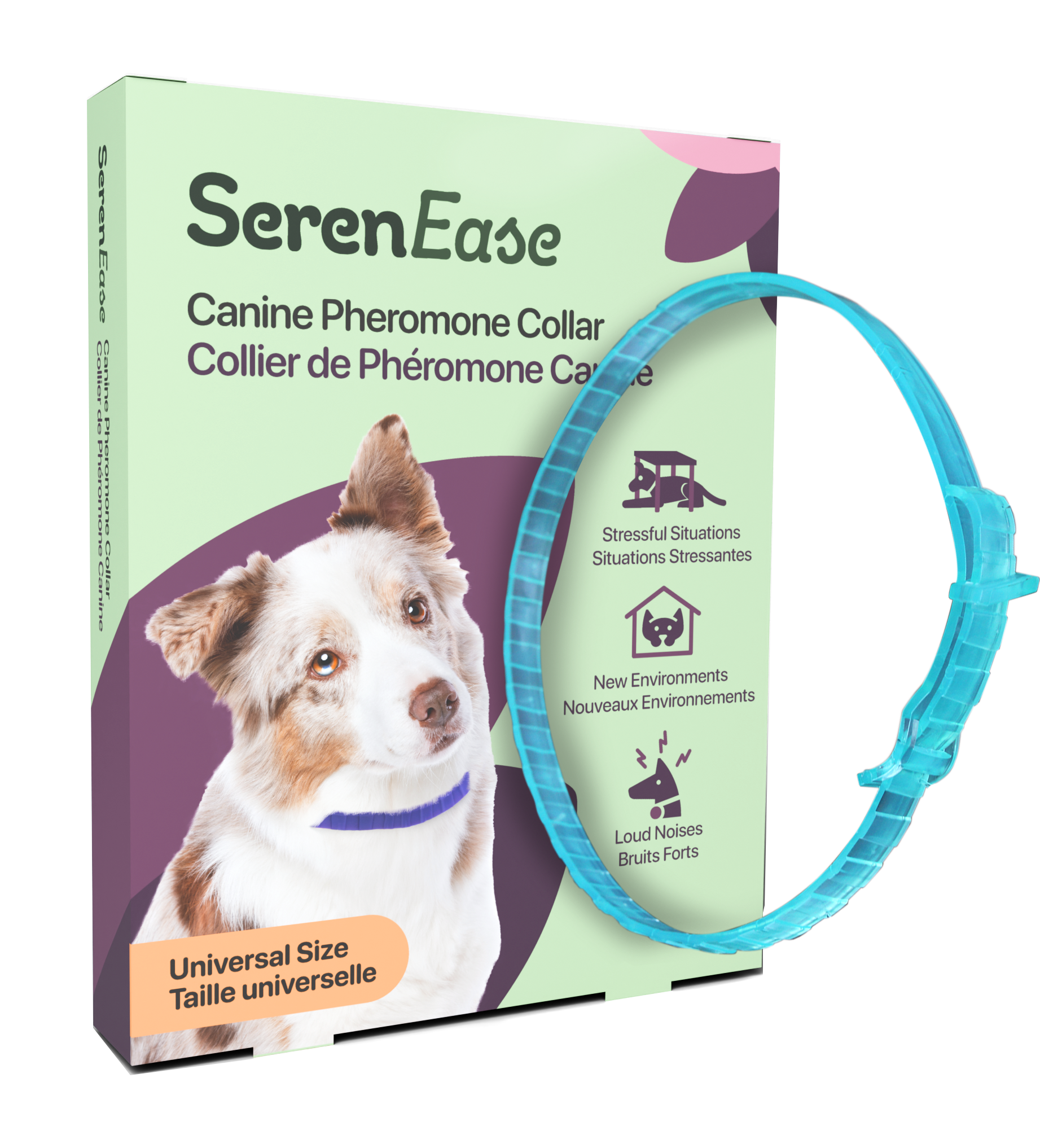
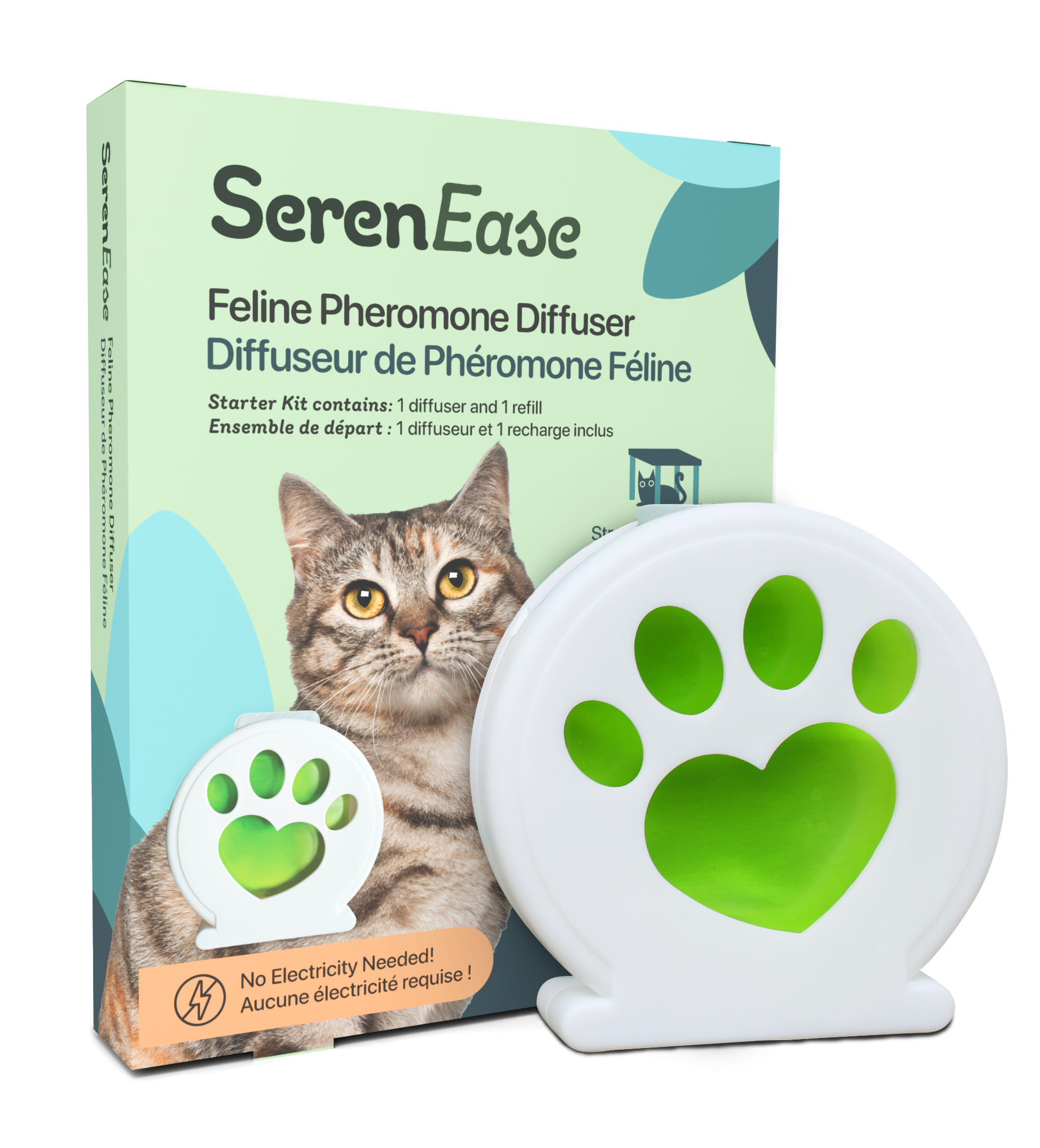
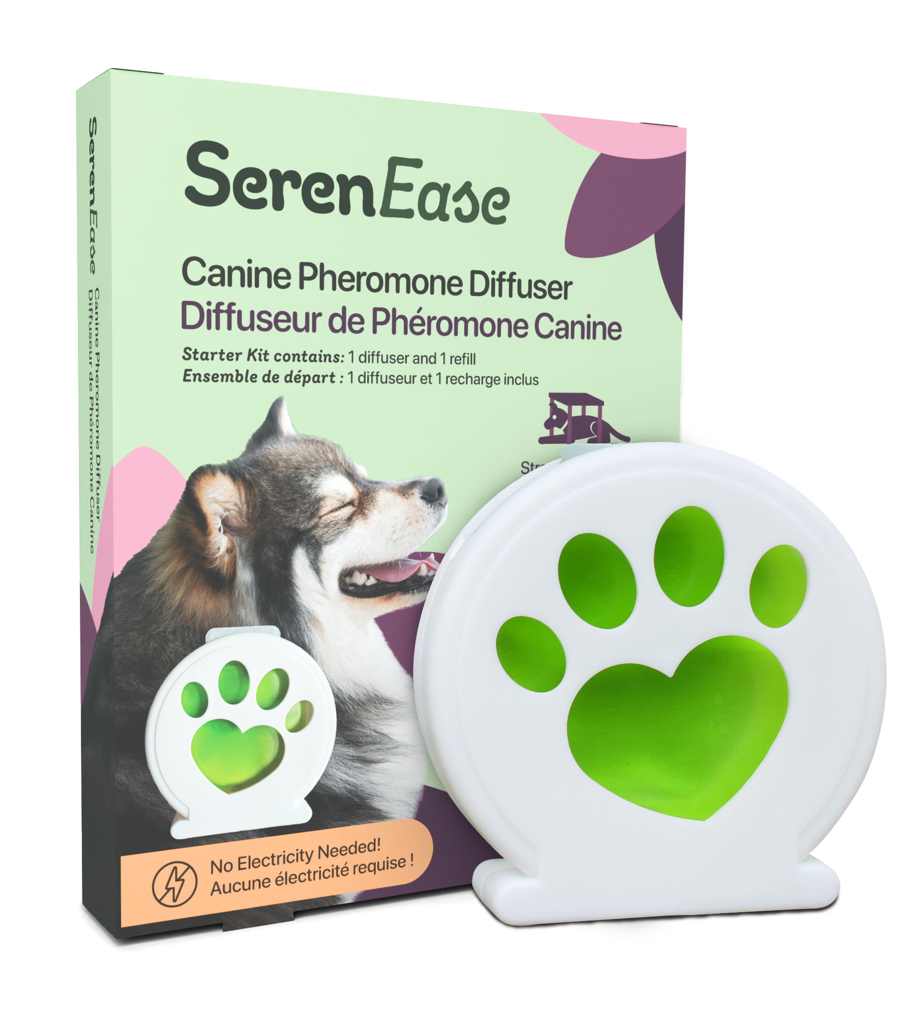
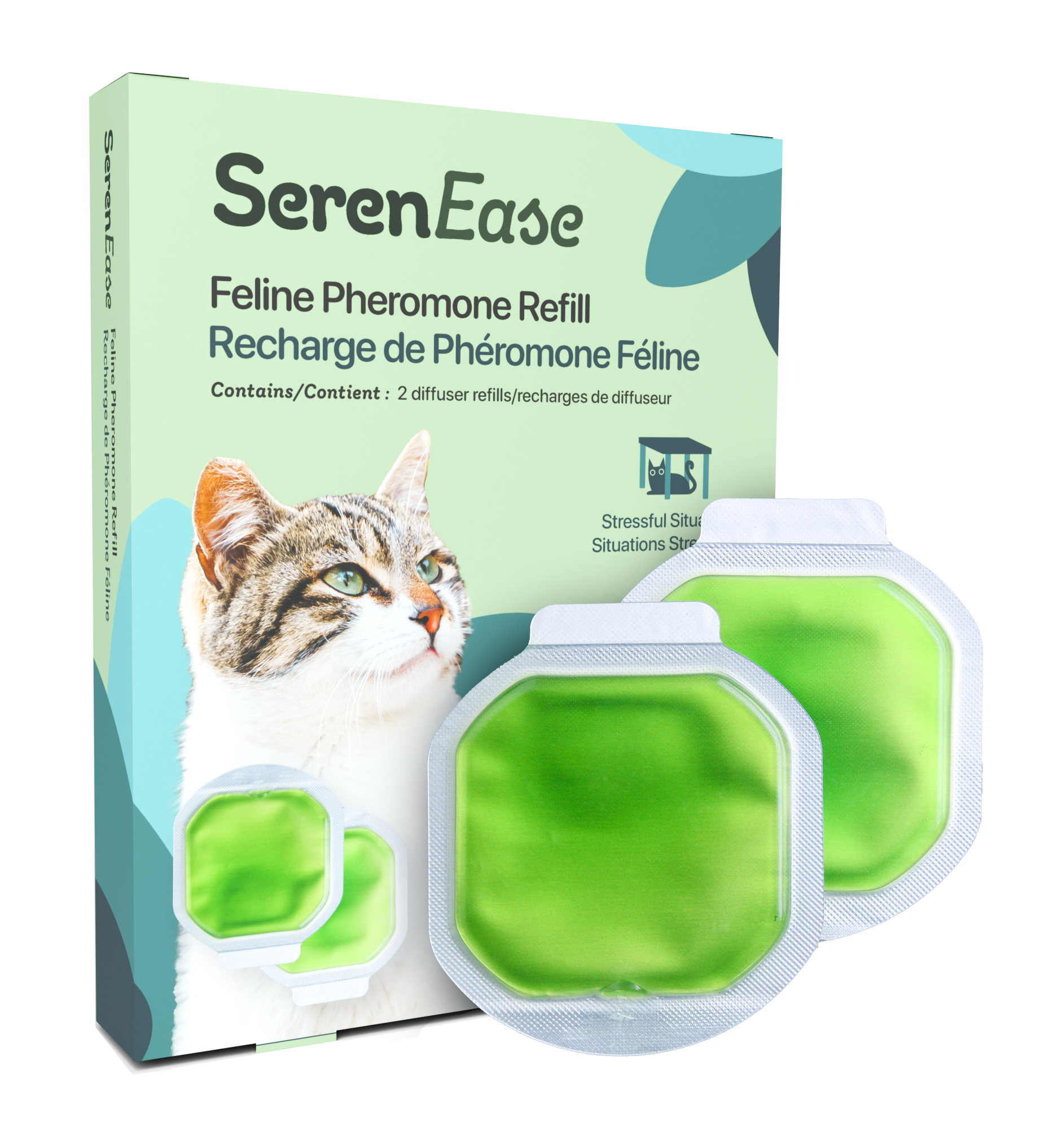
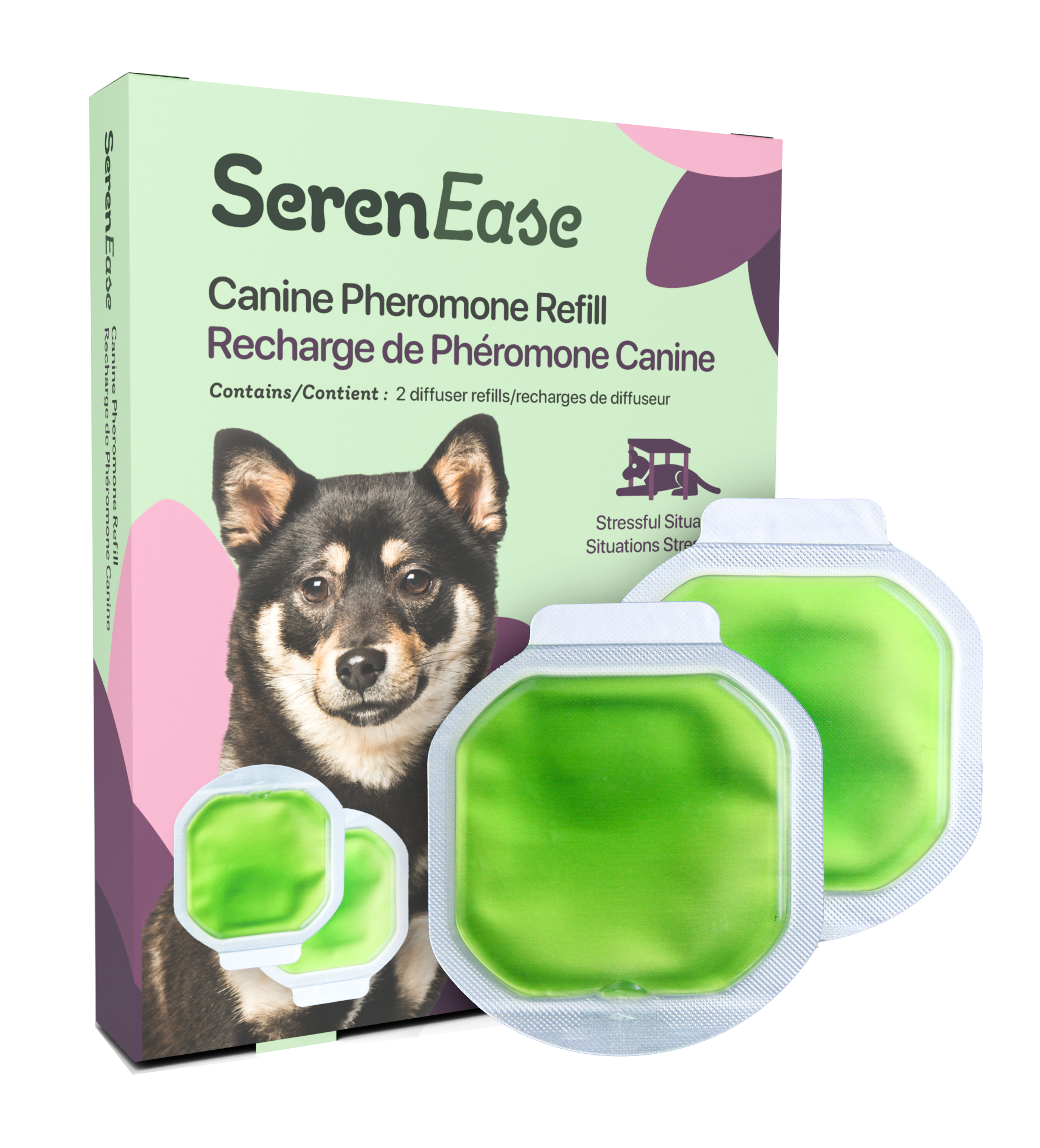
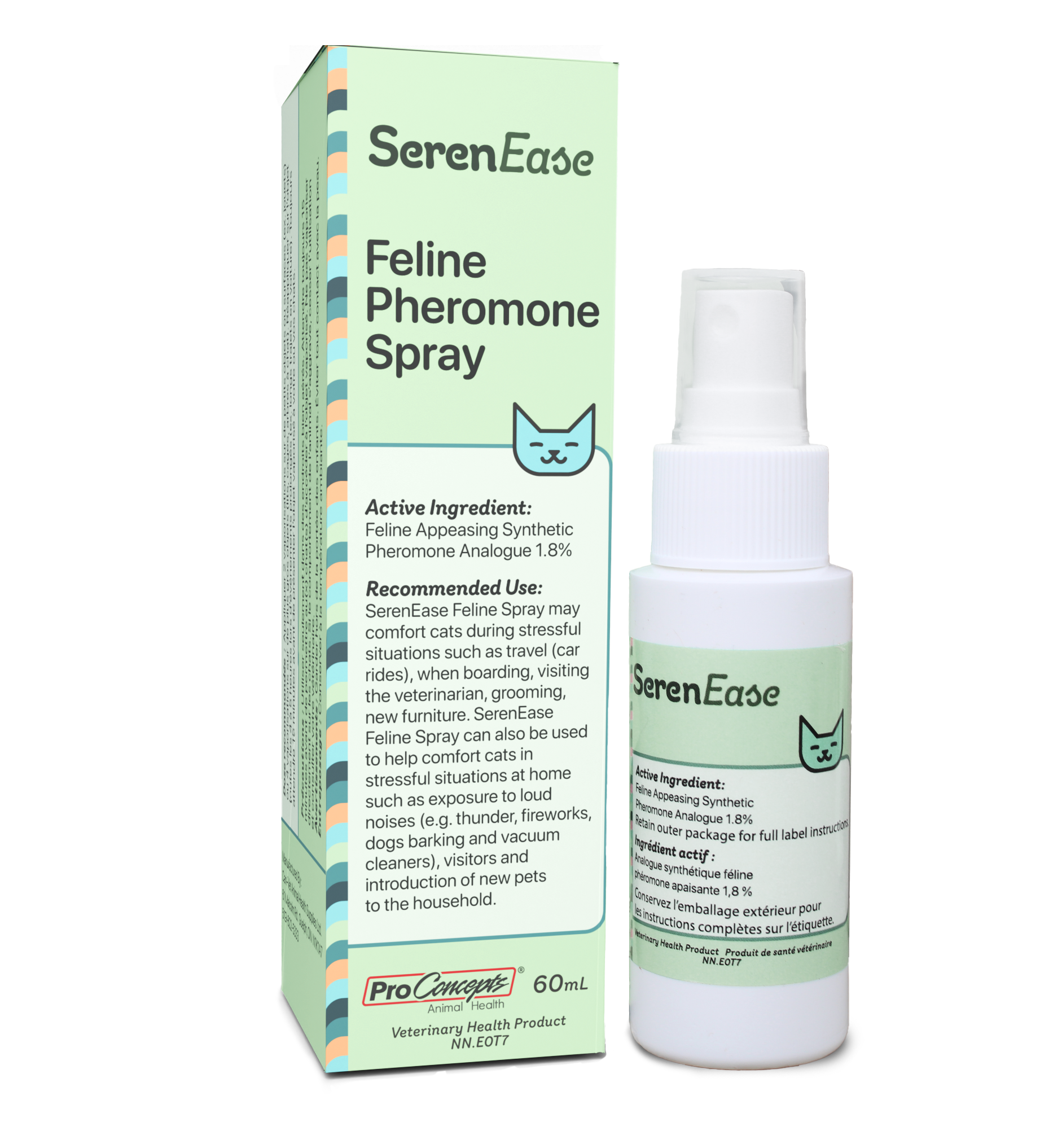
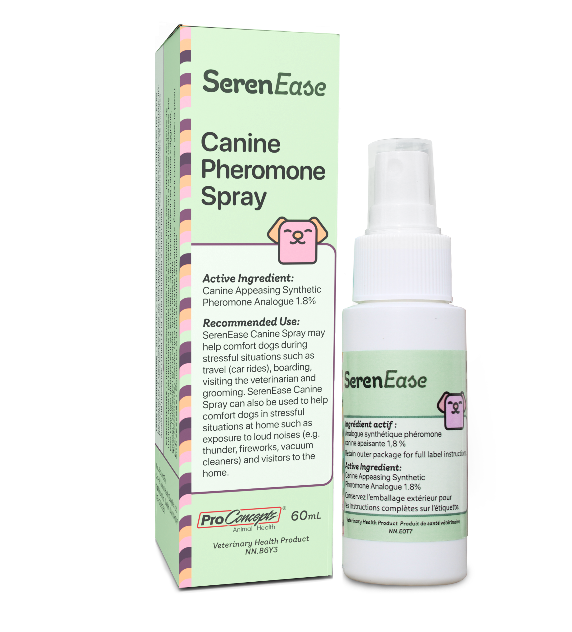
The people at SerenEase reached out to me to create branding and packaging for their product launch. They wanted something that felt calming, and reflected what the product was used for, calming pets. I took inspiration from nature, using organic shapes, and natural colours. A green is the core colour for the brand, with blues being used for products involving cats and purples being used for products with dogs. This helps easily distinguish between the two products, in cases where a customer has both dog and cat products.
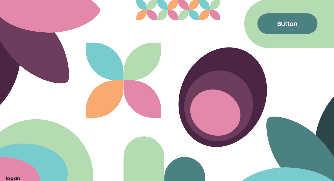
Branding
Layout
Packaging
Concepts
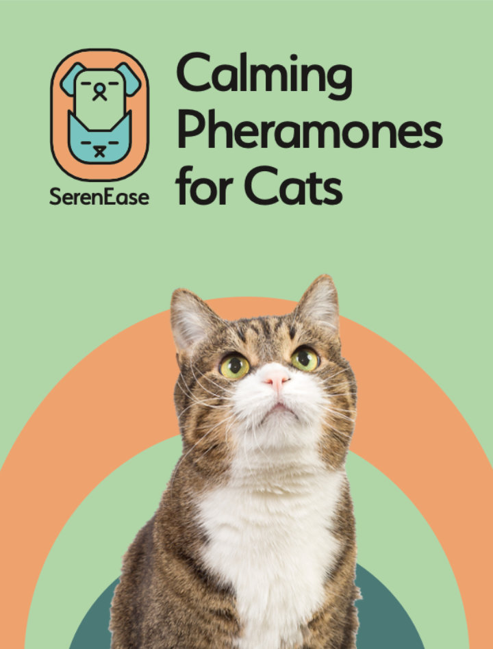
Shown are some early concepts. Taking inspiration from a mood board, I began working on different logos and branding elements. If I liked the direction of one I would take it and make a super quick artboard of what the front of a package would be. Although the initial concepts shown here were creative and playful, ultimately the client and I decided that legibility was more important. So I developed a simple and elegant wordmark that worked well on small packaging. This was the logo that was originally presented to the client but ultimately they said that it would be better to create a wordmark due to the small size of the packaging.


Original Pitch
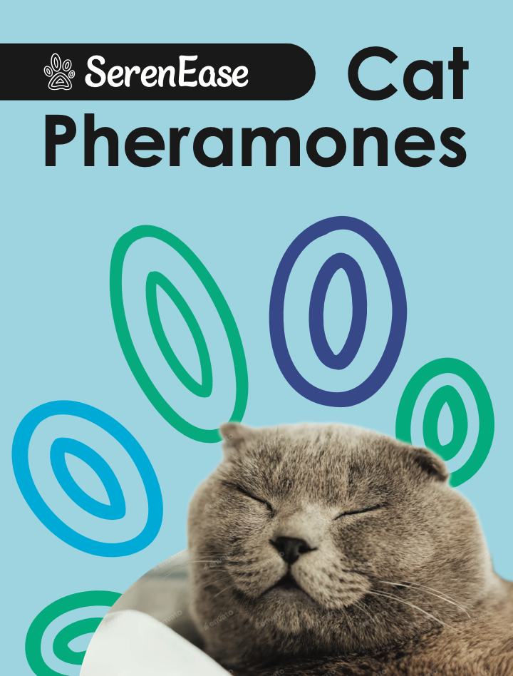
After choosing the direction to go, I developed a rough idea of the brand and pitched it to the client. Shown are some of the elements presented.
Final
After meeting with the client and needing to create a wordmark for SerenEase, I ended up with a fully type-based solution. Focusing on round edges and more free-flowing design. Emphasis was added to the ‘Ease’ part of the wordmark to emphasis the purpose of the products, and add more visual interest.
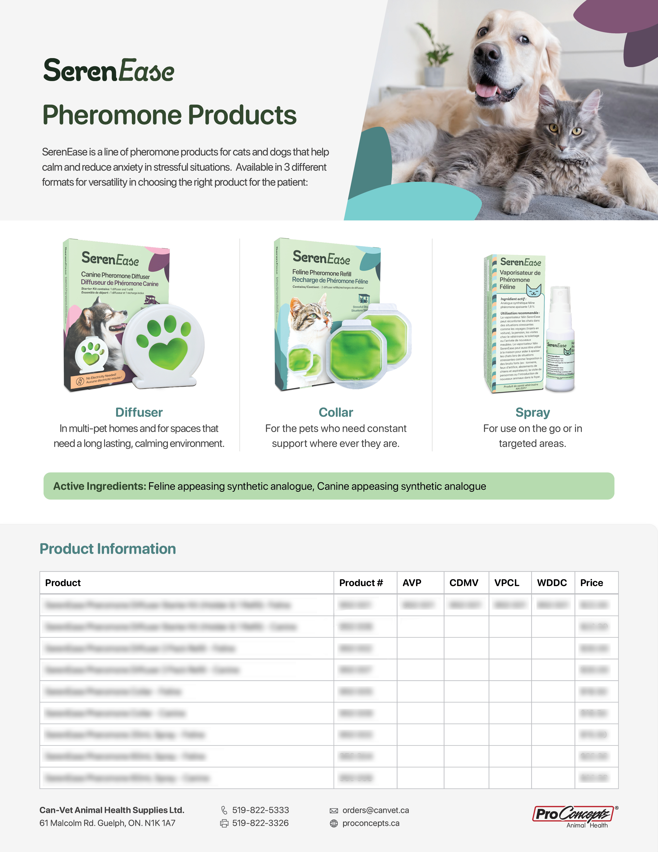
Products Detailer
I designed a products detailer which gave suppliers an overview of the products, as well as information needed to order each product.
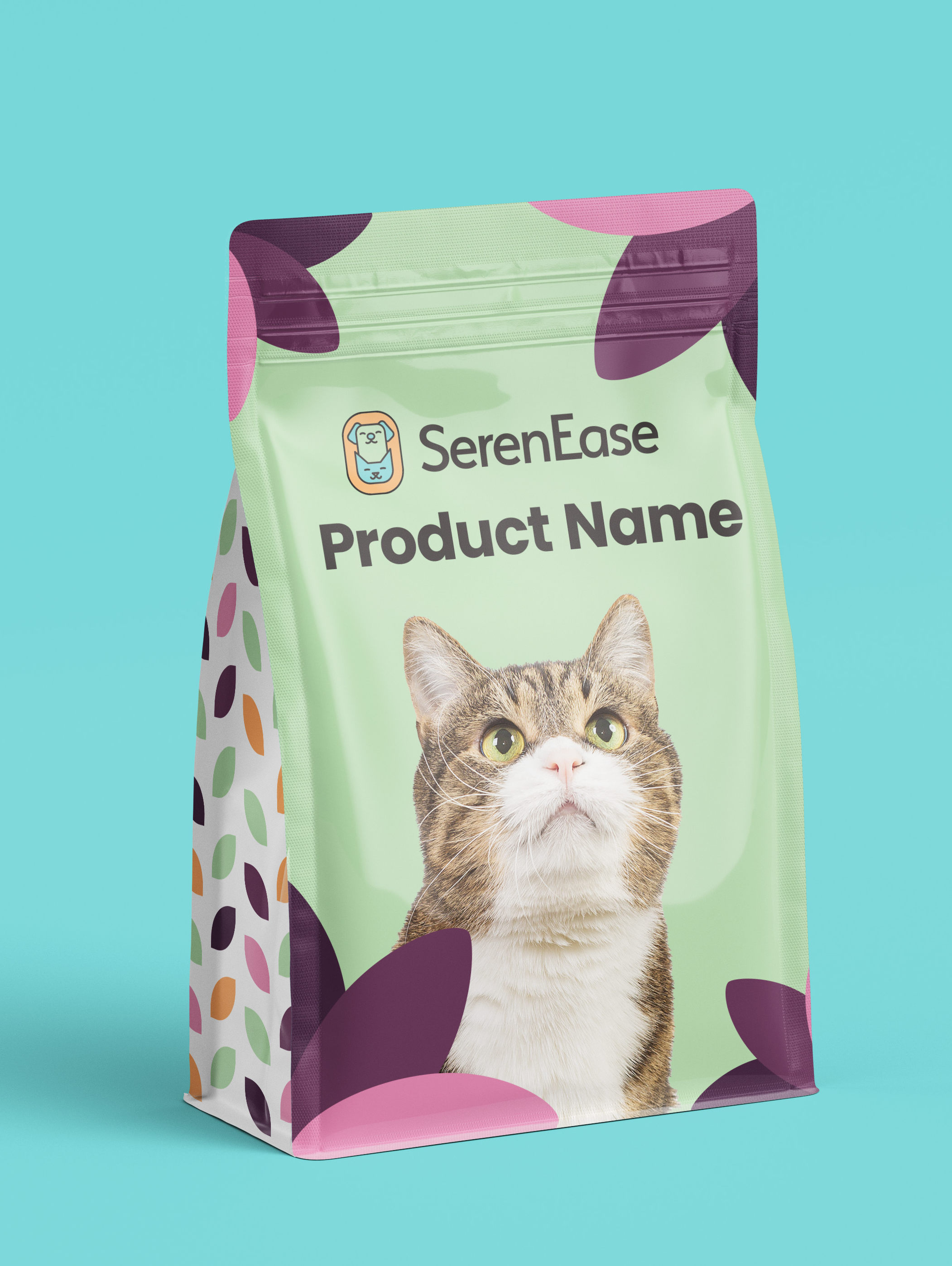
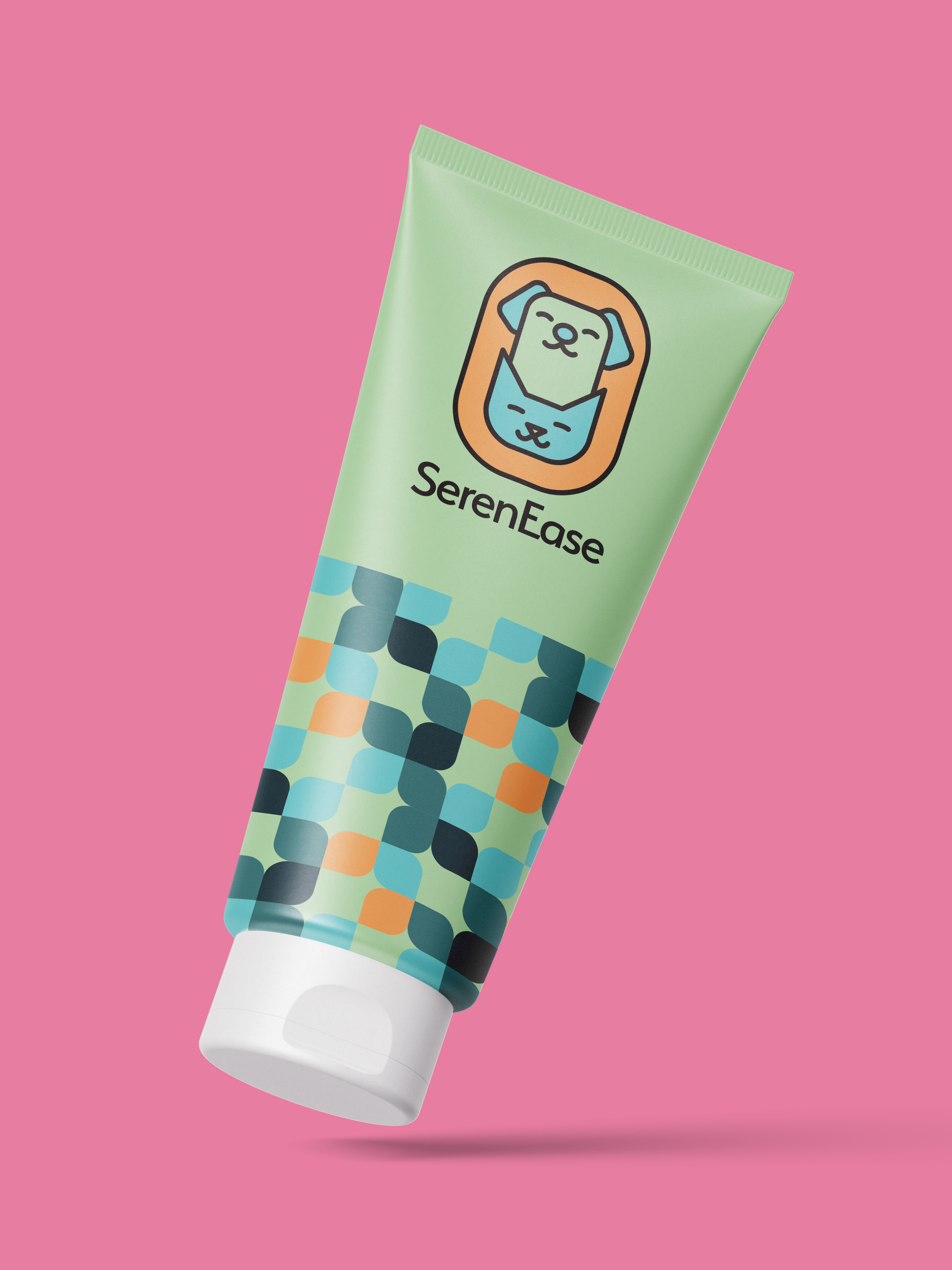
Packaging
These are the product images created for the packages I designed. The dieline was accurately recreated in Blender, and folded into shape, then photos of the products were composited on top.